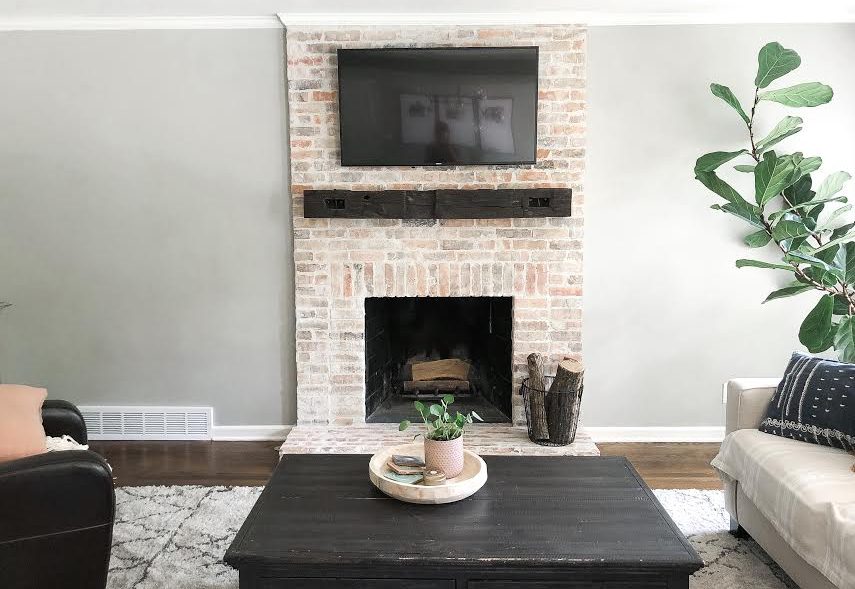
When we first moved into our home we completely renovated the fireplace. There was ugly tile surrounding the opening, it came halfway up the wall, and it had a glass screen over the opening. We used reclaimed old Chicago brick veneers to extend the fireplace to the ceiling, added a mantle from reclaimed barn wood, and got rid of that old glass cover.
At the time, we were crazy about it! However, it wasn’t long after we moved in that Brett and I both noticed the fireplace lacked depth. I never styled the fireplace wall because – Well, I had other projects on my mind and I never had a bright idea of HOW I’d style it. All of that to say, I think styling the fireplace wall would draw our attention away from the lack of depth issue and onto the pretty furniture / decor – Y’all pickin’ up what I’m puttin’ down?
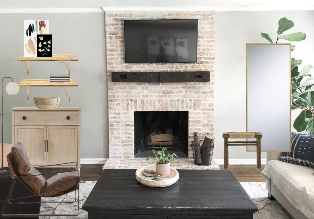
Well folks, the time has come! I have a design for the fireplace wall that I AM SO EXCITED ABOUT! I am ditching the gray buffet and leather chair we’ve had in our living room and adding more intentional pieces against the fireplace wall, rather that the side wall. The best part about it – With this design, we are moving the accent chair to face the coffee table (and the TV) so someone who sits in the accent chair is more apart of the conversation and can watch TV. Right now, our accent chair faces the room – So basically no one ever wants to sit there.
Here is what the wall looks like now:
And here’s the design / mock-up:
Can y’all picture it?! I am pumped and I am already getting started! Follow along on Instagram (@mindfullygray) to see how it comes together!
Thanks for stopping by, friends!
Jamie

Leave a Reply