Just off the kitchen in our new house is a dining area. We added two large muled windows in this space to bring in lots of natural light and also give us a glimpse of our wooded backyard!
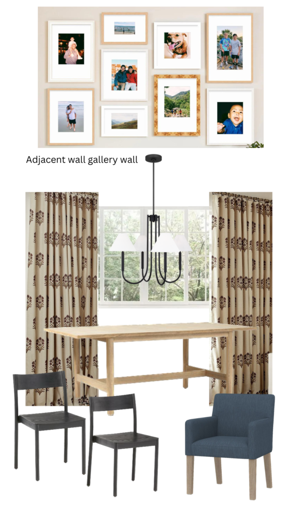
In our last house, the dining space was massive – we had an 84” long table that filled the space. The dinette in our new house is smaller – I found this dining table that extends from 60”- 80”. It has a timeless design and even has room for chairs on the ends.
I’m on the fence but I love the idea of curtains in this space. It’s add warmth and a fun pattern could add a touch of whimsy in here. The gallery wall will make such a statement but curtains make it feel more cozy. I’m still trying to decide if the curtains here should match the living room curtains since they are in a shared space. I found these curtains from Pottery Barn that break the bank (🥴) but ARE SO PRETTY!!
The light fixture I chose in here is an interesting story. Initially I found this light – it was a non-negotiable for me. I had to have it. But as things progressed and pricing came back, my entire lighting selection changed. I opted for more “dupes” per se because lighting can always be changed later. The lighting I ended up selecting is so good. This light gives the same vibe as my pricier picks for way less.
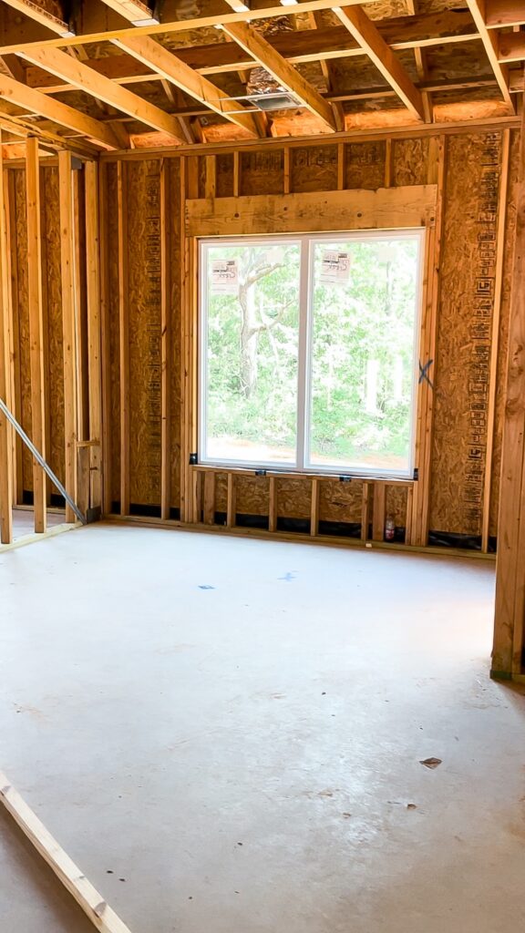
The dinette
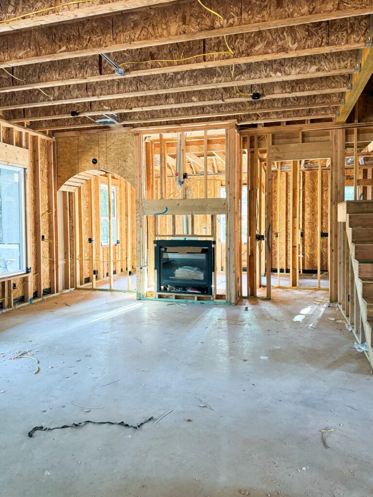
Peep the arched built-in. Dreamy, right? I had them add electrical above the built-in for a picture light. I like this location to somewhat fill the space above the bookcase and ceiling and make it appear taller.
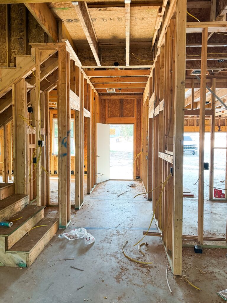
I snapped this picture because one day I’ll have an “after” picture here featuring wood beams on the ceiling and two drop pendants in between them! This entryway is going to make a statement, y’all! You just wait.
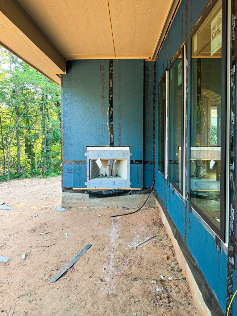
The outdoor fireplace is framed along the back porch. I am so excited to have a covered back patio & fireplace. It’s a small covered space but with the right furniture it’ll be cozy and feel bigger. We added a little depth to the fireplace on each side to give it a little interest. It’ll be painted brick, with a mantle, and TV hook up.
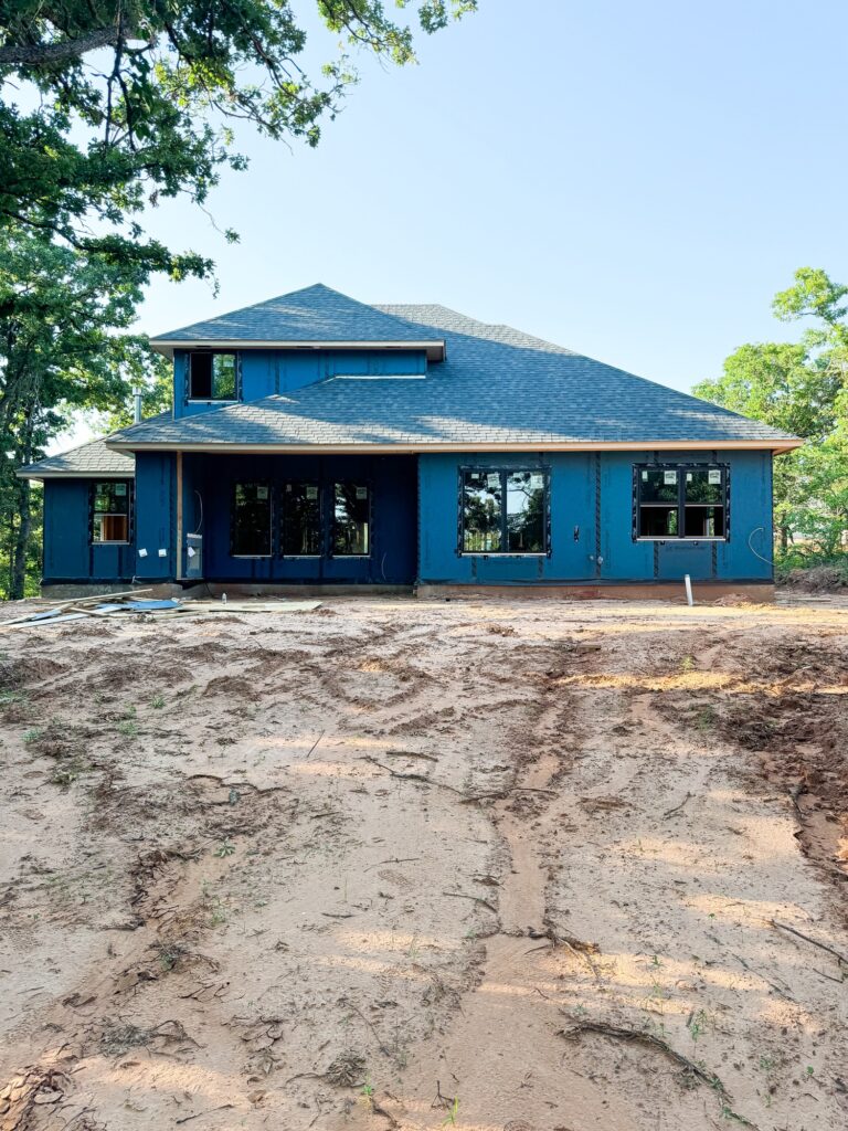
The house is a true story & a half. It has cute dormers on the front but you don’t see the second story fully unless you are looking from the back. The black exterior windows are the *chef’s kiss*. The large upstairs window goes to the playroom / bonus room space.
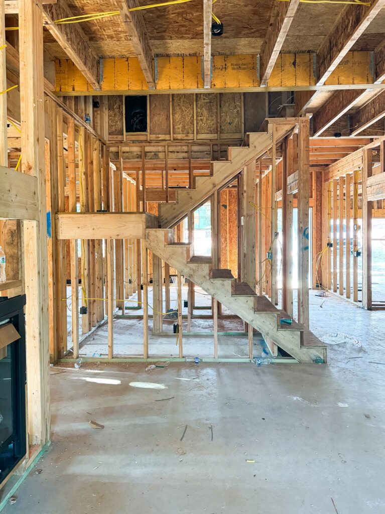
You can really start to see how this space will look with open railing. It’s going to feel so open and the railing we picked is so beautiful – it’s a statement in and of itself.
Every Friday we drive to see the progress made for the week and explore our neighborhood a bit! I look forward to it all week because, if I’m being honest – being in a rental house (even though it’s temporary) messes with my head a bit. I can’t wait to beautify our own home again!
